Power BI introduction-basic information
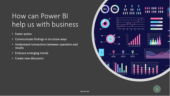
Tableau and Power BI are powerful tools to support users delivering business insights. This article gives a concept of Power BI including the introduction of diagrams, functions, and architectures. Before we start it, let’s see what are the benefits we can gain from using power BI.
Power BI structure
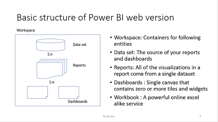
Now you understand that power BI is to help enterprises reveal problems and deliver precise information to stakeholders. We are moving to the topic of Power BI structure. Starting from workspace which is the area in which all the dataset, reports and dashboards are there. The dataset is the source of reports or dashboards, you can connect your dataset with DB, cloud DB, excel or other tax files. Once you connect your data source with a dataset, you can create your reports. All the charts in your reports are based on the columns in your data set, you can use the column directly or calculate the columns in your Power BI desktop version. For the dashboards, you can pick up any charts from your reports to assemble a dashboard. All the key information could be gathered in one dashboard.
Introduction to Charts
To design which chart is used for the information present is very important. Here I collect some charts which are used the most in power BI.
Slicer
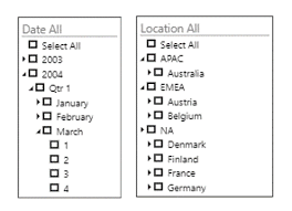
A slicer is to provide a filter for a specific focus on showing data, usually, I will put it ahead of all designs. A slicer also represents the perspective people view the data.
Bar chart
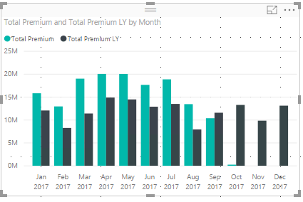
The bar chart is one of the basic visualization charts. It displays different categories or same category in a different time slot
Area chart
The area charts are to display amounts based on the online variation. The area represents the amount of a predefined time.

Combo chart
The combo charts provide three dimensions to show the data. the axes are on the right, left and bottom.

Doughnut chart
The doughnut charts display the composition percentage, and you can put the title or description in the blank in the center

Gauge chart
The gauge charts explain the progress of a goal or a target, giving information about the gap between actual and forecast

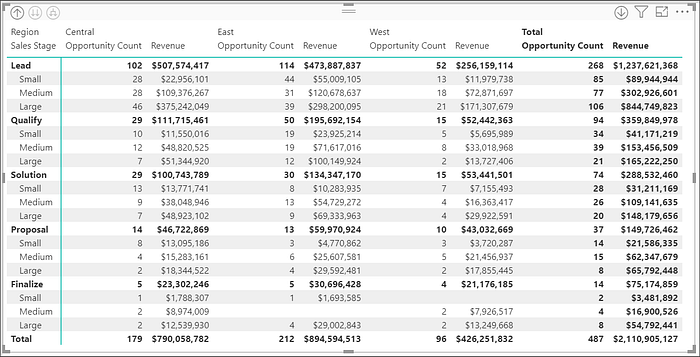
Matrix
Matrix provides a two-dimension view of your data, it is a bifurcated analysis and is able to be drilled down by putting more detail information in the chart
Card
Card and multi-row cards are charts that show important figures in the dashboard. I usually put those important numbers in the first sheet of the dashboard. It is a good way to summarize the previous month's efforts and to start your reports

There are other charts that are useful to show the outcomes of data in Power BI, you can also download customized charts through Power BI import function in the visualization area. I will have another article to introduce more functions in power BI.

